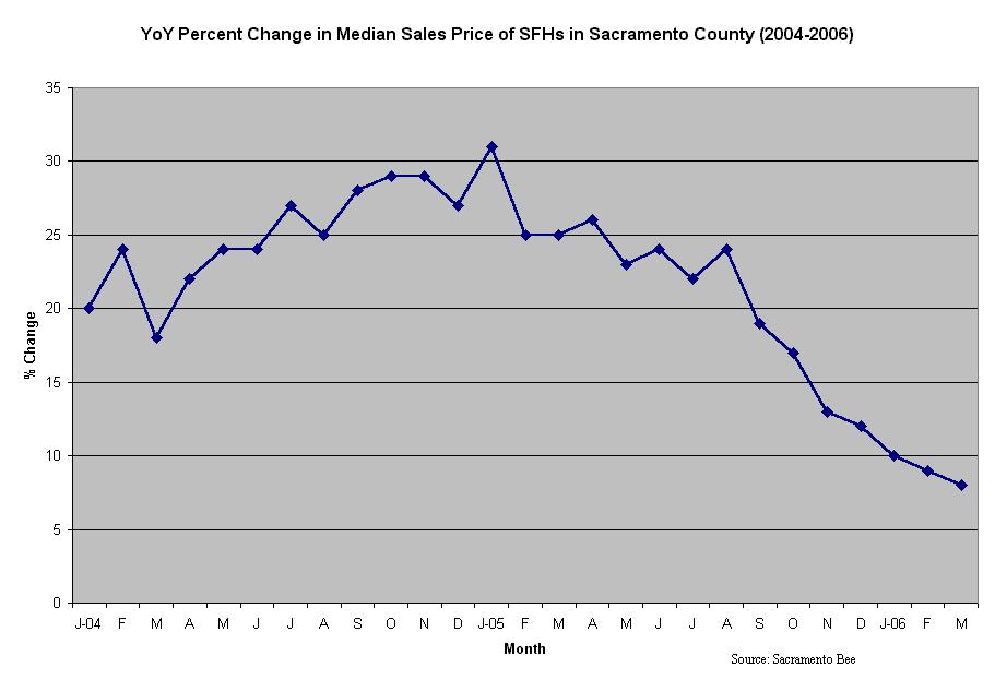
The first graph shows the percent change in price over the prior year. The time period is from January 2004 to March 2006. Appreciation has been slowing for seven consecutive months.
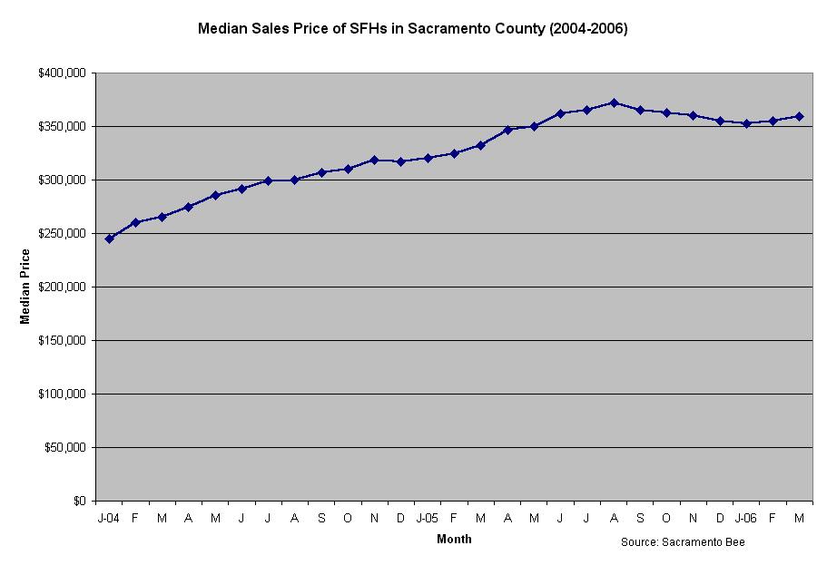
The second graph shows prices between January 2004 and March 2006.
 Return to Home
2 comments:
can we see the data for Yolo county?
I do have data for Yolo, El Dorado, and Placer counties. If I have time, I may post graphs for these counties in the future.
Post a Comment
Comments are closed.
Note: Only a member of this blog may post a comment.