May 2006 Sales
The following three graphs show sales of existing single-family detached homes in Sacramento County only. Click on any graph to enlarge it.
The first graph shows the year-over-year percent change in the number of homes sold. May marked the 14th straight month in which sales were less compared with the same month of the prior year.
The second graph compares the number of monthly home sales in 2004, 2005, and 2006.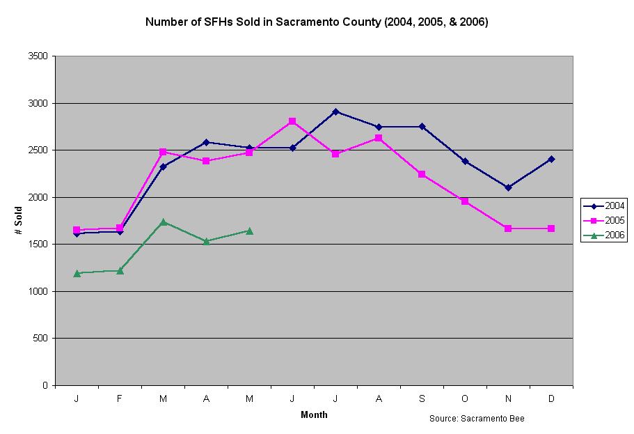
The last graph shows the number of homes sold between January 2004 and May 2006.
4 comments:
Where's the median price chart? I know we don't like to show that one cause it's soft landingish, but I like to see it any way.
Plus I'd like to see that YoY appreciation graph that was falling like a set of car keys. That one is really gonna look like it's coming in for a nice soft touch down.
Where are they?
It's coming, not to worry.
By the way, I've updated the inventory graphs to include the May SacBee data.
{sarcasm}Look it's rebounding!{/sarcarsm}
Post a Comment